INTERVIEW 2017
by Jessica Fernandes, Spark CG Society
April 25, 2017
The VFX Magic Behind Smurfs: The Lost Village
Smurfs: The Lost Village is a visual treat. If you grew up reading the comics or watching the tv series, this year’s reboot film will feel visually familiar in all the right ways. A throwback to the original Peyo designs, the film features richly detailed environments, beautifully animated characters and FX that remind us of how an update to a 2D classic should be done.
Related >> Smurfs: Imbuing Characters with Life
To help us navigate the process and gain insight into the CG magic for the film, we sat down with Mike Ford, VFX supervisor on the project. Our interview with him, below:
This newest installment of the Smurfs feels like a closer throwback to the original Peyo Smurf design. What can you tell us about this?
The conversation started between Kelly [Asbury, director] and Noelle [Triaureau, production designer]. They wanted to make sure the movie looked as much as possible like the original comics Peyo had drawn — not only in terms of the characters, but also for the environments and how shots were composed to make it look as much like the original material.
Noelle and Patrick Mate [character designer] are both French, which gave us an advantage as they had grown up reading the comics: they were already familiar with the Smurfs characters and universe. I was first exposed to Smurfs in the Hanna-Barbera era, via the television series. I also had the figurines that I used to play with. Our process started with the question: What makes a “Smurf” a “Smurf?”
How about in terms of the environments?
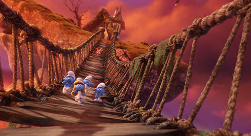
The production design team really focused on Peyo’s aesthetics in terms of creating a lot of depth. We wanted to make sure we didn’t have flat or uninteresting surfaces. For example, we did an initial test for the Smurf village, but it turned out that we build the ground too flat and that was really unappealing. Because the Smurfs are so small (only a foot tall), we needed to make sure that you felt you were down low, on the ground, with them. At this level you would see things differently. A tiny hill might feel like a mountain, it was so much better when you saw elements overlapping, etc.
Even the way that Peyo drew things in relation to the Smurfs was something we looked at. Everything is always on a larger scale in relation to them. We tethered to that idea. For example, if a Smurf sits in a chair, the chair is much larger than him. If he walks up to a table, he has to reach up, or get up on a stool to reach the top of the table. Door handles are always twice as big as a Smurf’s hands. Peyo did this to make the Smurfs feel young and child-like. We wanted to do that too, make them feel small and charming.
Given that the look changed so drastically from the previous Smurf films, was there much that you could re-use, or did you have to start from scratch?
We made a fresh start. We had looked to see if we could use pieces of the previous versions (as there was a Smurf village in the first two films). However, these were done quite a few years ago and our tools and processes had evolved since. It made more sense to start over from a design and technology standpoint.
The cartoon aesthetic seems to permeate all aspects of the film. What can you tell me about the FX in this regard?
Peyo does a lot of interesting things with the way he draws FX. He has a really cartoony aesthetic — smoke coming out of chimneys are drawn to follow a serpentine path, puffs/clouds of smoke are large billowing rounded-edged masses, etc. To stay true to this, we generated clear, readable outlines for the clouds, explosions, etc. This carried over into the aftermath of effects as well. Eg. in Brainy’s lab, when an explosion blows a hole through the wall, the shape of that hole and rounded edges for it were designed keeping Peyo’s aesthetics in mind.
We referenced a lot of different sources for inspiration. From anime, to the beautiful work done at Disney on 2D classically animated films. We looked at how they handled water, smoke, etc. I looked at a lot of books for reference on hand-drawn animation, so I could better figure out how to translate that to 3D elements. How do you take a 2D drawing and make it feel 3D, be able to move around it, while still having it look like the original Peyo designs.
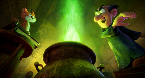
We made design and colour palette choices and carried that through the film. For example, Gargamel’s magic is always green; Smurfette’s magic is always blue. Kelly was keen to have everything feel cartoony. So even the magic coming out of Gargamel’s hands has defined shapes instead of looking real/photo-real. In the back of our minds, we were always thinking: “how would Peyo have drawn this?” Which meant having the FX team scratching their heads figuring out how to do things differently than they were used to. Suddenly having spiky shapes for an effect might seem normal.
The levitating river is stunning. How was that achieved?
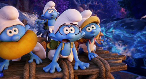
Creating the river was one of our biggest challenges. We started with creative concepts from the production design team. Given that there are multiple streams intertwining, we treated each stream as a tube. We rigged each tube and passed it on to the animation team for manipulation. They animated the tubes themselves and also defined paths along them that the characters would travel.
Because the river is levitating, we referenced NASA footage of astronauts playing with water in space. This allowed us to better understand what happens when water defies gravity, what it looks like when it collides with objects, how it sheds off, how much sheds off, etc. Our FX department applied these learnings in their fluid simulations for when the river collides with rocks, trees, and animals. A good example of this is when our Smurfs first see the river, with fish jumping in and out of it. As Hefty says in the film “It’s like a workout for your eyeballs.”
To complete the look, FX added a bioluminescence pass to mimic the look of algae bloom when the river contacts objects.
I recently became aware that Smurfs rode bunnies in the original TV series. What can you tell me about your version of these bunnies in The Lost Village?
The glowing bunnies were a magical addition to the forbidden forest. As with other elements in that forest, when in darkness or shade, certain elements have bioluminescent qualities. The rabbit warren and chase (where the rabbits open their glowing eyes in the cave and a stampede ensues) was one of the first sequences we worked on. For it, we had to figure out the right amount of glow for the bunnies and where they should glow out of (eg. The eyes, mouth, body).
Expanding on this idea of bioluminescence, plants in the forbidden forest had these qualities as well. In certain shots we had plants lit normally (with a specific palette in full daylight) and lit differently (with a bioluminescent glowing palette) in areas of shade. Given this, almost all elements in the forest had two different looks, determined for us by the production design team.
It would be extremely time consuming for lighters to manually define which plants are in shade and in the sun, in different shots. As such, we had our shader team write a macro for this. It figured out “if I’m a plant, am I getting sunlight or shade?” which helped automate the process by texture switching accordingly.
For reference, we looked at bioluminescence in real-life creatures. Eg. Creatures that exist at the bottom of the sea, in reality. Between that and sci-fi films with bioluminescence, we had good reference of what the plants needed to look like in this world.
The film is rich with beautiful reveals and tableaus. What can you tell us about these?
Cartoons have a unique compositional aesthetic that Kelly was big on us keeping to. He wanted us taking cues from how Peyo designed the Smurfs comics, particularly in terms of how he framed them. Peyo had a way of really focusing and drawing the eye to specific areas of the page, building a compositional frame around them. For example, he would point the tops of trees towards the center of the page to draw your eye towards that area. Drawing from this, Kelly coined the term “the egg” — which is the focal point of where we wanted our audience to look. Using Peyo’s comics principles, we leveraged light, shade and colour to focus the audience’s gaze to where it was most important.
A good example of this is the initial Smurf village reveal. In it, the trees around the periphery are in darkness/shadow. This helps focus your eye to the bright, vibrant, lit up village in the center. Another example is the monster flower attack, one of our most dynamic sequences. Here we played with depth of field, colour palette (vibrant yellow flowers in foreground, blue and purple flowers in the background) and motion to push the details of the complex background back, highlighting the action to focus on. Throughout the movie, we created these frames with light and dark, guiding our viewer on where to look.
What went into designing the dragonflies?
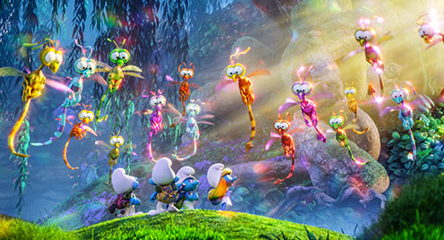
Patrick was always looking back through the original comics and series to see if an element or similar element already existed. We chose to give the dragonflies big eyes that were stuck together, as that was an element that already existed in the Smurf visual language. For us, it was important that anything we created, if popped back into a Peyo comic, would fit in that world.
Kelly wanted the dragonflies to look magical, but also translucent and gummy. Using a lot of subsurface scattering on them allowed us to achieve that.
On top of everything, the dragonflies actually breathed fire. To reflect the cartoony aesthetic, we created big, spiky shapes and limited color gradients for the fire. For example, there were not as many shades of colour within the fire. Instead it went from bright white, to red, to yellow. It still looked like fire, but with a comic influence.
With such lush environments and attention to detail, I imagine your scenes must have been very heavy. What was your heaviest shot/sequence?
The forest scenes were definitely the heaviest. Anything with trees... due to the level of detail and stuff on the ground. There were definitely some “grin and bear” it moments in terms of render times. But the team did a great job at making the process as efficient as possible.
In the big reveal, when Smurfette first walks out into the forbidden forest, there are 60+ trees, lots of ground cover and a multitude of individual plants that all need to get loaded into memory. Thankfully, we have a system that instances elements (only loading one of each element and populating the rest with virtual copies, instead of loading the full element over and over). We also split out the scene into different passes — foreground, mid ground, and background. That way you’re not loading all those elements in at once. Instead, you can render each pass individually and composite them together later.
In terms of software, we use Arnold, Katana and our own proprietary assembly/component system, which allows us to generate really big data sets. For example, some trees have 40,000 leaves and 60-90 polygons per leaf. That’s tens of millions of polygons to create the forest. There’s no way we could render that out without instancing. Also, anything not visible to camera gets pruned out. If you don’t see it in frame, it doesn’t load into memory.
The animation in the film was fun, over-the-top and beautifully exaggerated, fitting the cartoon feel. What can you tell us about setting up for and animating on this project?
At Sony we’ve done lots of different styles of animation, including photo-real characters and more cartoony. The style in Smurfs is obviously not photo-real, but it’s not Tex Avery either. It’s somewhere in between.
Alan Hawkins [senior animation supervisor] brought a lot of ideas and life to these characters. And it was great to have the opportunity to see Gargamel and Azreal animated in 3D, as they had been live action in the previous films.
The initial Smurf design had a centre nose-bridge. We wanted to do away with it but there was a technical hurdle to overcome and we didn’t have time to address it. However, when Alan came on board, he put his foot down, stressing the importance of getting rid of it. The rigging team figured out a solution that made it work within our existing facial system and we went from there.
Another issue to address were the floating eyebrows. In the comics, the eyebrows float off the face. We did an initial test, cheating it to see if it would work. It allowed us to pull the eyebrows off the face, but now we were worried about the shadows they would cast (especially since the movie was being done in stereo). The shading team went in and worked to fix that. They made it so you could control the effect — the further you got away from the skin, the less dense the shadow would be. You could control this manually, on a case-by-case basis, but we found that the generic settings we put in place worked well 80-90% of the time. Once we say that the test worked, we rolled it out to all the characters, including Gargamel and Azreal.
Taking a flat 2D character and translating it to 3D must be quite the feat. What other considerations did you have to take into account?
The main issue we faced was that a Smurf’s face doesn’t look like a Smurf unless it’s mostly posed in the ¾ position. That’s the way Peyo drew them and that’s how they look best, in ¾ profile. From a geometry standpoint, we build the mouth in the middle of the face and had to move it from one side of the face, to the other. When you move it, you have to move/cram a lot of geometry into a small space. The mouth shapes have to work on both sides of the face and you also need to be able to push the mouth shapes for more extreme expressions. To do this, we build mouth shapes for the middle position, the right side, and the left side. As the character turns his head, the mouth shapes have to come across the face, under the eyes, back to the other side.
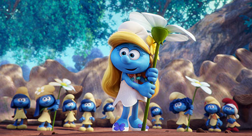
We also struggled early on with Smurfette’s iconic hair. Peyo drew her hair with big bangs that sit on her head. When she turns her head, animators and the character effects (CFX) teams needed the ability to move the hair from one side to the other. The animation team used a buffer body to represent the shape of the hair and had controls to move it when she looked left or right. The CFX team had to create grooms for two hairstyles and had to enable blending between them. You couldn’t just pop the grooms on and off, or it wouldn’t look right as she turns her head.
Given that Smurfette is at the main character in this story, was particular attention paid to her design or rendering?
A lot of what makes Smurfette iconic was conveyed in animation — making her feminine, matching her character in the comic/series. She goes through a lot of different moments in the film: serious moments, light-hearted ones, etc. Our lighters worked hard to complement and help match the story the animators were trying to tell.
The hair was the hardest part of making her look good and believable. There’s a lot of hair and Smurfette’s bangs block out a lot of light. Sometimes we had to light her hair and eyes differently, just to ensure her face didn't get too dark. She had a bit more special treatment than the other characters in that respect.
Smurfette also has an iconic big swoop in the back of her hair. We held onto this, maintaining that volume for the majority of the movie (just a few strands coming out now and then). Peyo had drawn her hair as one big block, so we wanted to stay true to that look.
Anything you are particularly proud of, or found particularly challenging?
The environment was the biggest thing because the camera is so low to the ground. We knew right from the beginning, reading through the script and looking at the storyboards, that this would be an important consideration. We really worked hard to make you feel like you were right there with the Smurfs, at their scale. Using really shallow depth-of-field made you feel like you’re really small. And we created a lush, beautiful, detailed environment to set the stage for these characters to exist in.
We also really challenged the FX department to do a lot of things. They handled most of the ground cover. The modeling department created physical geometry and we added a procedurally generated “creeping Jenny” vine that grows over things. Anything you see when you’re low to the ground with leaves and trees, FX populated this throughout the Smurf village, Smurfy Grove and the forbidden forest.
And finally, who's your favourite Smurf?
Handglider Smurf (he flies in and out of frame a few times in the film). I had the toy when I was a kid; putting him into the film felt great. He was an iconic character for me. Flying feels fitting for these characters — a very Smurfy thing to do.
Thank you to Mike and the team at Sony for allowing us such an insightful peek behind the curtain. For our readers, armed with these new details, we hope your viewing experience is further heightened. And the fun doesn't stop there! Stay tuned for Part II, where we sit down with Valerie Morrison, Supervising Animator on the film, for a closer look at what went into animating our little blue friends and their world.
All images and clips copyright 2017 Sony Pictures Animation. All Rights Reserved.
 |
Jessica Fernandes is an adventurer and wordsmith based in Vancouver. She enjoys spreading appreciation for the arts through stories and encounters with inspiring creators. |
![]()
![]()
© 2025 · Spark CG Society


